
More WWII stuff for you instead of comic book stuff.
Yes, still on hiatus. Aww, I miss you, too. Did you do something different with your hair? It looks great.


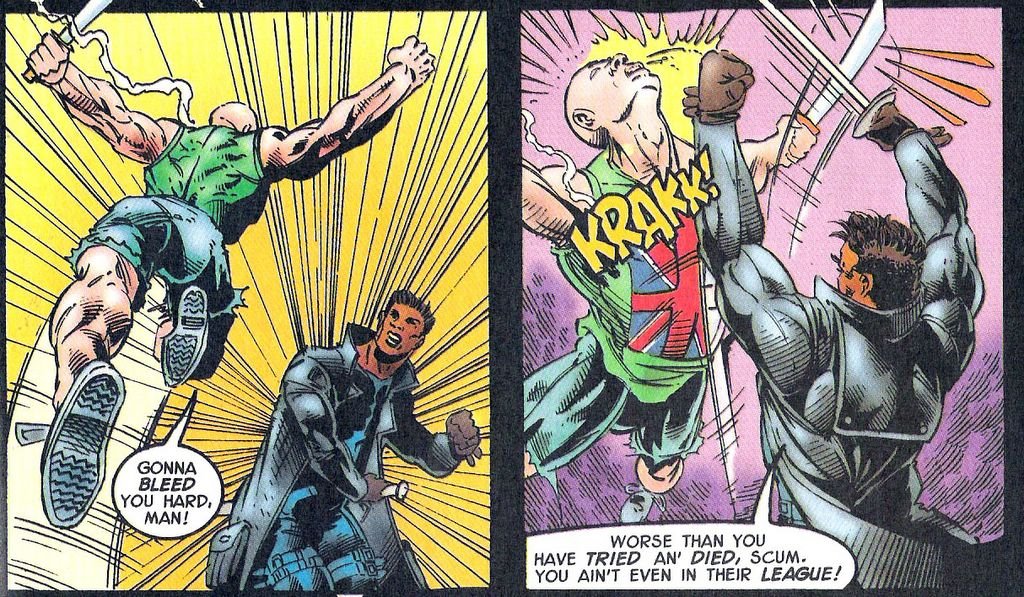
“Gonna bleed you hard, man!”
I don’t even know what the hell that means. How do you bleed someone hard? That makes even less sense than “jack you up.”
I can just imagine Blade screenwriter David Goyer reading this comic and thinking, “This is brilliant! I’m going to use that scene in my movie!”
Okay, I’ll admit it, aside from that one scene, Blade the Vampire Hunter has little in common with the Blade film, which I loved. It has little in common with any quality comic, either. It has that stench of suck that pervades many books published during the mid-Nineties, the Dark Age of Comics. Rushed looking art, heavy inks, horrible computer coloring, and awkward dialogue. God, the dialogue…
For example, here’s Blade in da club, bottle full of bub, when he senses Dracula’s presence:
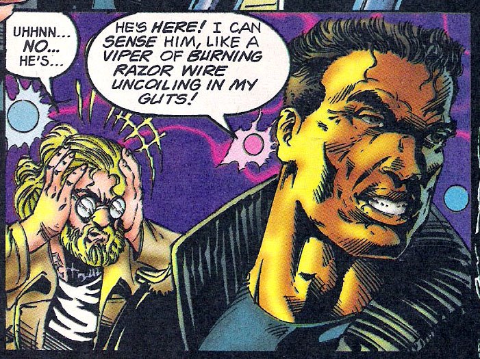
I don’t think that’s Dracula in his guts, I think Blade stopped by a taqueria truck on the way to the club. You gotta watch that shit, Blade – even daywalkers can fall prey to E coli.
But seriously, what kind of line is that? “I can sense him, like a viper of burning razor wire uncoiling in my guts!” It’s like that was written by a random metaphor generator. “I sense his presence, like a toothbrush made of lava scrubbing my perineum!”
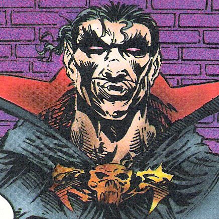
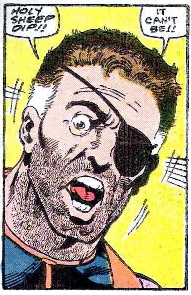
Of course, Dracula does show up, as you might have guessed by the cover, above. Blade The Vampire Hunter #2 offers a new take on the legendary vampire. Here he is a muscular dude with huge hands, a cat whisker moustache, and a face like an ass. Behold:
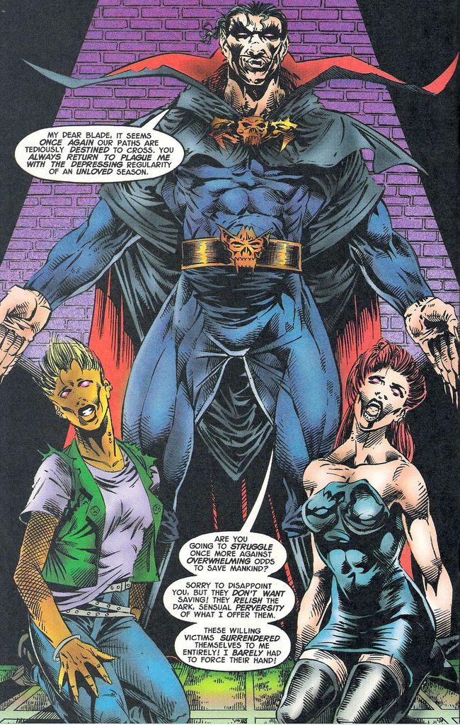
Love the belt buckle; it looks like Dracula shops for accessories at Hot Topic. What the hell is he wearing, anyway? Take a look at his cape, the way it goes behind his arms. How could he even lift his arms wearing that? And how does he make his collar stick out like that? A lot of starch and under wiring, I imagine. It looks like his collar would bob and bounce as he walked, which I think would inspire snickers instead of dread. At the risk of sounding like a metrosexual, Dracula’s outfit is an utter disaster.
Fashion catastrophe aside, Dracula is still a bad-ass. He grows HUGE HANDS and mops the floor with Blade. Here’s Dracula in action, disemboweling Blade with his oversized mitts:
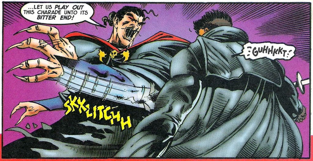
That panel is a really good shot of Dracula’s distinctive moustache, which defies gravity just like his collar and his hair. He reminds me of somebody, but I just can’t put my finger on it…
Blade The Vampire Hunter #2 may have been the partial inspiration for a scene in the Blade film, or it may not have. Regardless, I think anybody who has actually read this hackneyed comic will agree that it epitomizes that nadir of comic quality we know as the mid-Nineties. In other words: it sucks.
Who wrote it? Who did the art? Ah, heck – does it really matter? I don’t want to beat anybody up, I just want to mock the comic they produced. But when people wonder why Blade can be a popular film and TV character but can’t carry his own series – well, this is the reason why.
I leave you with one last look at Dracula’s hideously deformed mug, and I bid you, gentle reader, a good night.
*I am so deeply sorry.
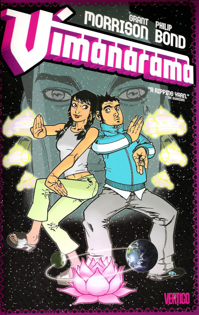
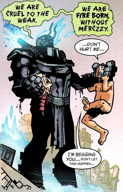
I received a lot of (okay, one) requests for the panel in Grant Morrisson and Phillip Bond's Vimanarama where the Atlantean demon Ull-Shattan forces a member of the British Parliament to kiss the severed head of another MP. This macabre panel is noteworthy because it takes place in a comic book that otherwise has very little in the way of severed head kissing.
Now, I understand that cartoony depictions of forced necrophilic foreplay is not everyone's cup of tea, even if it is well drawn. Therefore, I have placed a picture of something cute in this post before the severed-head kissing panel for the benefit of the more sensitive or discriminating Dave's Long Box reader.
Here, then, is a cute picture of a baby panda:

Now move the kids away from the computer screen.
Here is the severed-head kissing panel:
.
.
.
.


 worshipped by Aleister Crowley, while the Ultra-Hadeen represent the virtues of man. I’m still reeling from that last issue of Alan Moore’s Promethea, my mind isn’t up to the challenge of decoding Morrisson. I’m going to have to have my wife read it and explain the Secret Metaphor to me.
One could make a compelling argument that the villains in DC Comics are better than the villains in Marvel Comics, or visa versa. I don’t know whose Rogue’s Gallery is better. How can you decide when you have to factor in cats like The Joker and Dr. Doom? I mean, The Joker is a bona fide cultural icon, but if there is one thing I’ve learned in my decades of comic book reading, it is that Doom reigns supreme. It's a tough call.
I will save the debate as to the relative merits of DC and Marvel villains for another day and instead focus on one area of villaindom where Marvel clearly reigns supreme: The Ranting Powerhouse.
Marvel has a ton of these guys: Mr. Hyde, Abomination, The Wrecker, The Executioner, Rhino, Terrax, even The Hulk… These are individuals who throw cars down city streets while screaming about how they are the strongest of all or how their power is supreme or how all will bow before them.
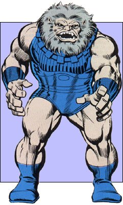
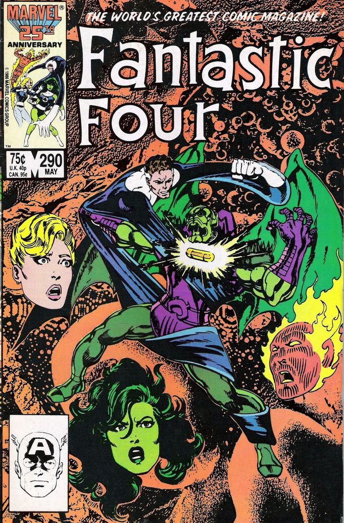
Fantastic Four #290 features not one but TWO Ranting Powerhouses: Blastaar and Annihilus. You cannot get better villain names than Blastaar and Annihilus. Except for Dr. Doom.
Take a look at my man Annihilus. Gaze upon his beauty and despair:
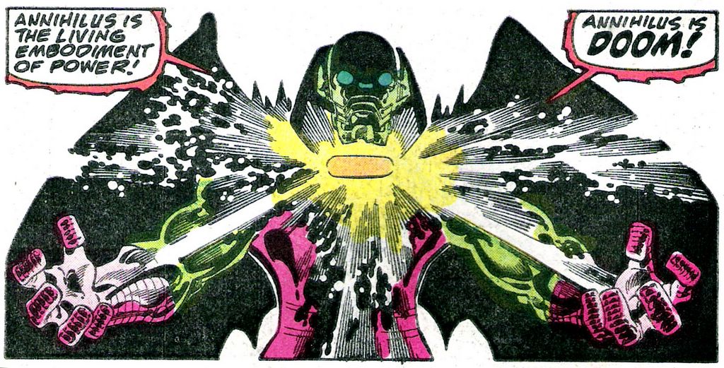
This guy has all the classic traits of a Ranting Powerhouse. He refers to himself in third person. He's enamored with his own power. He brags and is prone to wildly hyperbolic statements. Annihilus also speaks VERY LOUDLY. The only thing he is missing is a mountain of smoldering skulls to pose on or a mini-van to hurl.
It may not look it, but Ranting Powerhouses like Annihilus are very concerned with brand identity. They have a certain image to maintain and cultivate in order for them to be successful at what they do. Annihilus is all about annihilating things, so the Annihilus brand reflects that. He has a monstrous, intimidating appearance that communicates, "I am dangerous. Look out." Annihilus reinforces his brand by a) annihilating things, and b) raving maniacally. If nobody is afraid of a Ranting Powerhouse, he's doing something horribly wrong. As long as Annihilus stays focused and maintains his brand behavior consistently, the Annihilus brand is effective.
Observe:
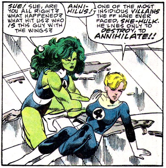
Now that is effective word-of-mouth image marketing. The Invisible Woman has prior experience with Annihilus and knows that his behaviour is consistent with his brand image - he annihilates things. She communicates this to She-Hulk, but little does she know that she is quoting literally from the Annihilus press release: "...he lives only to destroy, to annihilate..." She-Hulk's first impression of the Annihilus brand is exactly as desired.
None other than Reed Richards himself is also caught up in the Annihilus hype:
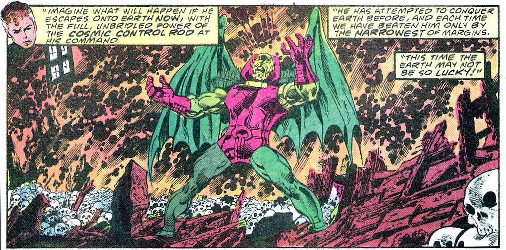
If that isn't brand reinforcement, I don't know what is. That image should be on Annihilus's website and on his business cards, it's perfect.
Okay, jeez, enough of that joke. That went on for a while, didn't it? Sometimes I don't know when to stop.
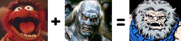
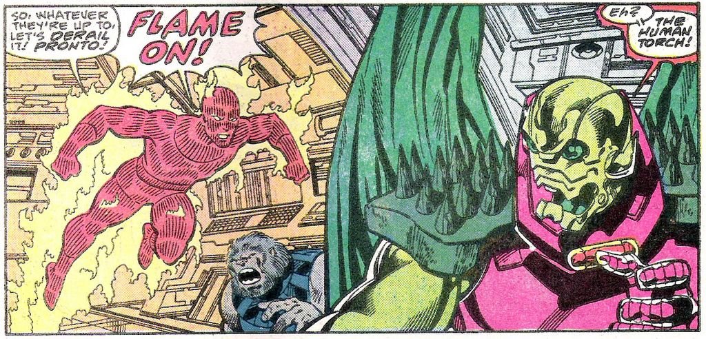
I realized that in all my excitement about Annihilus, I neglected to get a decent scan of Blastaar, which is a pity because he is kind of cute in a Tasmanian Devil way. He looks like the biker dad of Animal from The Muppet Show. Look, there he is cowering at the bottom of the panel:
I don't know that I have ever talked about John Byrne's lengthy run on Fantastic Four. I came to them late and collected and read the back issues. When I worked in a comic book store in college, I was responsible for sifting through all of our backstock and culling books that would never sell at back issue prices or that we had way too many of. I decided that we had way, way too many of the Byrne Fantastic Four comics so I put them in the quarter bins at the end of my shift, and then I bought them all at a massive discount and I was happy.
Boy, was I happy.
This might sound blasphemous, but to me, John Byrne's version of FF is THE definitive version, the classic model. I had only a fleeting exposure to the characters when I was growing up, so to me, this IS the Fantastic Four. I could do a whole week on just the Byrne issues; he wrote and drew a ton of great FF stories that expanded on but remained faithful to Stan & Jack's original model. You could tell Byrne held the characters in a certain reverance and was really engaged in making the book, which was likely a lifelong dream of his. Sure, the book started to lose steam towards the end, but for my money Byrne had a great run on the book.
One of things I like about Byrne's earlier work is that he teamed up with some great inkers. I really prefer seeing Byrne's pencils inked by somebody other than himself; I think it forces him to do tighter pencil work. This issue is inked by affable Al Gordon, who does a decent job with all the cosmic stuff and spaceships...

Now that is some cool shit right there.
I wasn't so crazy about Gordon's inking when it came to faces and hair. I'm not sure what it is, perhaps Gordon's style is not organic enough or he doesn't use a heavy enough line - somehow his faces look off. Of course, he had the unenviable task of inking the Frightful Haircut version of The Invisible Woman in FF #290:

Here's a tip for all you ladies out there who are considering going down to SuperCuts with their brothers to get matching haircuts: don't. It is not flattering. Look at her - no wonder she's pissed, she must have caught her reflection in a shiny surface and seen her hair! She Hulk is laughing her ass off in the background and Conan O'Brien back there doesn't look happy either.
Well, that's all for today. What? What do you mean, "what's the comic book about?" You got a couple of cheap gags, now you want a plot synopsis, too?
True believer, if I told you the terrifying tale of fright and fury found in Fantastic Four #290, the pillars of your tiny world would be rocked and you'd react just like Nick Fury, Agent of S.H.I.E.L.D. :
'Nuff said! Excelsior!!!
 As with any social movement or sub-culture, there is an extreme fringe whose views are not shared by the majority, or at the very least not shared with fanatic intensity. Fans are no different. A common and recurring theme in fandom is a rigid devotion to a “classic” model of their obsession. Any deviation from that model, any disruption of the status quo, is a personal attack against the fandumentalist.
 hated most was the killing, specifically the scene in which Batman drives the Batmobile into The Joker’s Smilex plant via remote control and drops a hubcap bomb, killing all his henchmen. Batman doesn’t fucking kill people, Tim Burton!!! That’s just missing the whole damn point of the character! Man, that pissed me off to no end. I was ranting in the movie theater parking lot afterwards.
 Warner Brothers has to make money off of Batman in order for me to keep enjoying select Batman products.
 The late, lamented Fanboy Rampage sifted through the message boards and blogs to find nuggets of hostile, histrionic hissy fits from overzealous fans. As a fan of Fanboy Rampage, I was frequently appalled but never shocked by the spectacular heights of indignity and spite that a fan can achieve.
 And even if you violently disagree with some chump about the best Stargate: SG1 episode or something, what the hell, at least you are communicating with another human being instead of beating on his dumb ass.
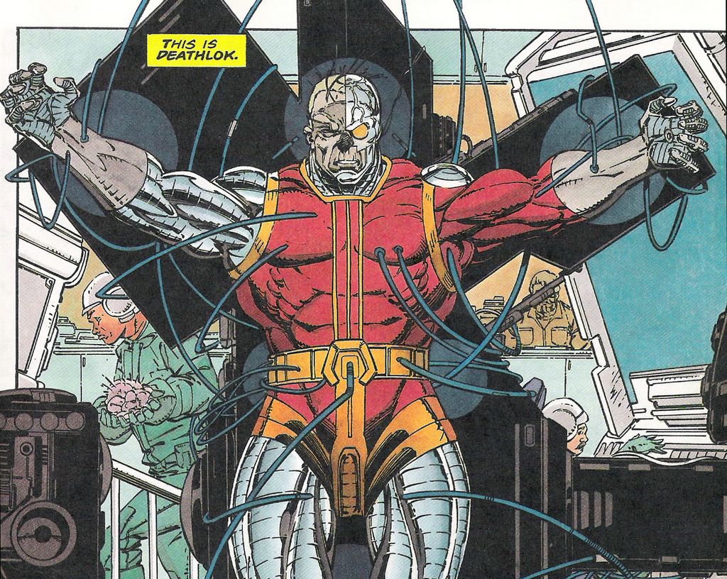


It looks like a 12-year old drew that cover. In the back of a bumpy school bus. With his left hand. And his eyes closed. I guess Deathlok was finally victorious over his true enemy, Editorial Quality Control. I mean, am I wrong, or is that an awful cover? Everything but the logo sucks ass.
The Deathlok mini-series was popular enough to launch an ongoing series that lasted a couple of dozen issues, if memory serves. It was OK, I guess. I can't say I remember it very well.
You know, I wish Marvel had riffed on the original concept a little more and had launched a whole family of cyborg titles, all tailored to very specific micro-markets. Imagine the possibilities…
Deathwok – Asian chef Martin Yan turns into a cybercuisine killing machine. This Iron Chef will serve your ass to you with a nice plum sauce!
Deathrok – Megadeath front man Dave Mustaine – part man, part machine, all metal. With his cyber powers he hunts down all those mean kids who made fun of him for playing D&D in high school. Incidentally, the Megadeath song “Psychotron” is loosely based on the Deathlok character. I can't decide whether that is cool or kind of sad. I'll go with "cool."

