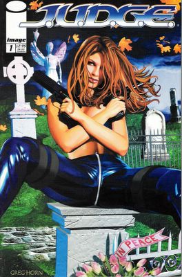
Hey, it's about time you grew the balls to tackle Greg Horn's J.U.D.G.E.
Challenge answered, my friend!
I think Greg Horn is good at what he does - let's just get that out of the way now. The guy's a talented artist who is mostly known for his cover work. Greg Horn specializes in photorealistic-yet-painted art of hot but curiously emotionless women. I'm sure his covers for Elektra and Emma Frost helped those books sell and were, um, passionately studied by male readers everywhere. Horn also has done covers for game magazines and some commercial art for big clients like Nike. Perhaps this is limiting of me, but I think of Greg Horn as a cover artist, like Alex Ross and Adam Hughes. Greg Horn is good at covers.
Unfortunately, Greg also created his own comic book J.U.D.G.E., published by Image. Horn wrote the book and did the art, which wasn't a great idea. The story is a weird downbeat mess full of shrill, screaming characters. The art is lurid and confusing, doing little to advance the scant plot. In my mind, J.U.D.G.E. is a classic example of a comic made by somebody who is good at creating covers and posters, but not so great when he applies his skills to the tricky world of sequential art. In other words, J.U.D.G.E. blows.
Seriously. It's Uwe Boll bad. That's right; this is the comic book equivalent of House of the Dead.
I felt like THIS when I was done reading it:
The key problems I have with J.U.D.G.E. #1 is that I don't like the story or the art.
I'm not saying that each individual panel of art sucks. Some of them do, but overall it's okay. It's just that the art doesn't visually tell the story well and it's really hard to read. I would bet that if you took a panel from J.U.D.G.E. and a panel of any Matt Wagner art and showed it to Johnny On-The-Street, they would say that Horn's art is better. And that's because people are stupid. It's also because Matt Wagner's art is designed as part of a narrative, existing to serve the story and work as part of a greater whole. (It's also because Matt Wagner fucking rules) That's not the case here.
Horn used models to attain his photo/painting look. I imagine he just took a lot of pictures of his subjects and used them as photoreference or something, I'm not really sure. As a matter of fact, a Dave's Long Box reader named Sam was a model for one of the characters in this issue. Here he is:
"I too look forward to your review, because I am IN J.U.D.G.E.!Greg used a lot of the guys from his local comic shop as models (he had already killed the owner in Espers)... He does however have a shit load of money and is married to the girl on the cover."
Nice! I say more power to Greg. I still think this particular comic sucks, but more power to him. Sam, you'll have to tell us which character you were!
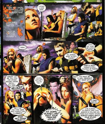
Or I should say, which mannequin? The characters in this book are as stiff and posed as the pirates at Disneyland. All of the annoying characters in the book are either yelling or wincing, and are often put together awkwardly in a frame in ways that seem to defy perspective. J.U.D.G.E. is like a fumetti - the strangely inert yet always fascinating photo comics that we all loved. Well, not all of us. There are a lot of floating head shots in J.U.D.G.E., too - when there's no room for a character in a panel, they get reduced to a tiny floating head in the background. Plus, the lighting! The characters are always the same vibrant flesh tones, regardless of setting; it's like the lighting in the circus tent is the same as the lighting in the cemetery. Horn also eschews the use of conventional comic book panel borders and gets creative, but the result is that some pages, particularly the ones that feature a lot of characters, turn into this big jumbled mess of colors with little distinction between panels. It's like an optic puzzle or something. Let's take a look. Click on the image if you'd like to enlarge.
The whole thing just blurs to me, until it looks like this:
You see what I mean about floating heads? Well, not literally floating, but there are characters who are kind of just pasted into the background, barely tethered to their surroundings. And where is all this golden sunshine coming from that lights all the characters from every angle in this gloomy cemetery?
Moving on: the story is about a group of young, incredibly bitchy and high strung operatives for a secret organization called J.U.D.G.E. If they worked for a secret organization called J.U.G.G.S. I might have bought the second issue. This gang of petulant assholes receive their orders, visit the circus(wa-huh?), then ambush some bad guys in a cemetery, arguing and whining the entire fucking time. We learn important details like their names at the end of the book, in a little bio section. Why they put it back there, I don't know, but somehow I doubt I would have picked up any extra understanding of the material if I had known the name of the purple-skinned asshole. Anyway, the incompetent and bickering assholes spring their ambush in the aforementioned brightly lit cemetery, and Things Go Horribly Wrong. You guessed it, The Nice Girl dies.
So does my interest.
Horn may have hit his stride in later issues of J.U.D.G.E., but I stopped at number one. Can you blame me? I don't have money to spend on comics that suck.* As LL Cool J says, "you only get one shot at love."
*Obviously, this is not true.


22 comments:
I don't own this comic, nor would I want to after reading what you said about it (see how much I trust you?), but it's sad that we now think of Hughes as a cover artist, since his interior work is so cool. Same thing with Bolland, I guess.
I got all three issues out of the quarter bin.
It does not improve.
Horn's wife is his model, and it was kinda funny when I flipped through The Greg Horn Sketchbook at Wizard World Philly last year, seeing naked chicks, and then looking up and seeing Horn's wife standing a few feet away from me, who's obviously his model. For every female cover he has.
Funny.
That image you posted reminds me of Leisuretown. This, despite Leisuretown being awesome, is not a good thing.
Speaking of books who use real people as models and spectacularly suck, perhaps you could do Crimson Plague at some point? Or perhaps that's too bad for even you to endure?
Oooh, Crimson Plague... That was bad! I think I have the 1st issue around here somewhere...
Horn bad...Jim Lee good...
When did the Leisuretown site go back up? I thought that guy took it down and killed himself or something. Well, glad it's back.
"...Greg lived up to his promise and gave me mussels that I still don’t have."
Did he tell you to clam up? Tee-hee.
Crimson Plague? Isn't that the comic about the grown woman created in a lab whose blood is acidic and will kill anyone who it touches?
So when she gets her menstrual cycle...
No, I'm not kidding.
You really aren't kidding! As much as I love Perez's art I couldn't manage to read Crimson Plague.
Not got much to say about Horn that hasn't been said already.
I haven't minded some of Horn's other work, but it's been years since I've seen something by him that didn't totally engage my *dis*interest. I see his covers and just go right on by.
I saw this comic awhile ago, back when it came out in 2000 and it felt dated, like something that would have been published in '93-'94. Just imagine art by some Liefield or early 90's Jim Lee imatator and all of the supposedly professionaly covert operatives armed with impractically large guns and seemingly no real chain of command gesturing angrily (shaken fists and pointing fingers in each others faces, etc) as they bicker and snap at each other even during one of their, again, "covert" missions. I think you'll see what I mean.
Actually, J.U.D.G.E. felt like a ripoff of Espers, the James Hudnall title Horn drew a few years previous.
Well that too, now that I think about it. I think it was all the bickering that put me in mind of a Liefeld/Lee wannabe comic. Though it did lack characters wearing costumes with bandoliers, lots of small pouches and pockets on them, and giant shoulder guards. And of course giant boxy guns.
That page is really annoying. I actually prefer the blurred-out one you provided, it hurts my head less.
I should have mentioned this in my post: One of the things I think is so funny about the page I posted is that these people are supposed to be waiting to ambush some bad guys in the cemetary. So of course, they all cluster together in plain sight, lounging on gravestones and occasionally screaming at each other. Way to keep it on the down low, J.U.D.G.E. crew!
They have all the discipline and unit integrity of Peg and Al Bundy.
One more thing about House of the Dead: no matter the movie's quality, the dueling commentary tracks on the DVD are pure GOLD.
I think that cover uses the exact same pose as one of Horn's Elektra covers. Annoying.
"They have all the discipline and unit integrity of Peg and Al Bundy."
That show was awesome. I'd buy a vertigo series about Married with Children
jesus. it looks like a comic version of Tom Goes To The Mayor. but like, i n a bad way.
Ah, the memories...
Dave, I really appreciate it. I hope you didn't buy this comic and then read it just to answer my dare. That would be brave, but would not compute.
That was one painful comic and I hope not many readers had the misfortune to go through it. Many thanks for thusly interacting with a simple reader of your blog and I wish we can see more of VM down the line, when it's convenient to you.
借錢 票貼 借錢 借貸 借貸 借錢 當舖 借貸 當舖 當舖 票貼 借款 借貸 借錢 票貼 二胎 週轉 融資 借錢 借款 當舖 二胎 票貼 借貸 借錢 借貸 票貼 當舖黃頁 借錢黃頁 貼現黃頁 借錢黃頁 借貸黃頁 借貸黃頁 當舖黃頁 貼現黃頁 票貼黃頁 二胎黃頁 融資黃頁 借錢 借貸 票貼 借貸 票貼 借錢優質黃頁 借貸優質黃頁 票貼黃頁 借錢 當舖 票貼 借錢 借貸 借款 貼現 貼現 當舖聯盟網 當舖聯盟網 當舖聯盟網 借錢 票貼 借貸 當舖 票貼 借貸 借錢 當舖聯盟網 當舖聯盟網 網站分類 網站搜索 網站搜尋 網站黃頁 網站名錄 網址目錄 directory 網站登錄 網站目錄 交換連結 台灣網站指南 網站指南 借錢 借錢 借貸 借貸 票貼 借款 借貸 借貸 借錢
It can't really work, I suppose like this.
ikea murphy bed | photography class | how much do braces cost for adults
Post a Comment